Foundations / 04
Logo
A strong, bold, graphic statement. Viewers read it many ways—a mountain reflected on a still lake, an arrow, an animal, a compass needle.

One mark, three forms

Logomark
Use the mark on its own whenever possible to indicate a GOHUNT communication.

Lockup
For added clarity: new areas of expansion, wayfinding and signage, co-branding.

Wordmark
Supports the mark on subsequent pages. Never a first-touch identifier. Monochrome only.
Four variations, one preference




Special use: Monochrome Orange
Sparingly, and only where you can’t control the background tone but can assume it’s near white or black—favicons, email signatures, user-customizable elements. There is no orange wordmark equivalent.
Give it room to breathe
xMinimum · Logotype
50pxon screen
1″ / 25mmin print
Minimum · Logomark
15pxon screen
0.185″ / 5mmin print
Don’t alter the logo
Don’t
Don’t stretch, squash, or distort the logo.
Don’t
Don’t rotate the logo.
Don’t
Don’t place the logo inside an outlined shape or box.
Don’t
Don’t add shadows, effects, or extraneous colors.

Don’t
Don’t use the light mark on a light background.
Don’t
Don’t use the dark mark on a dark background.
Equal weight, GOHUNT first
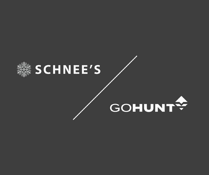
Do
A simple diagonal line creates clear delineation.
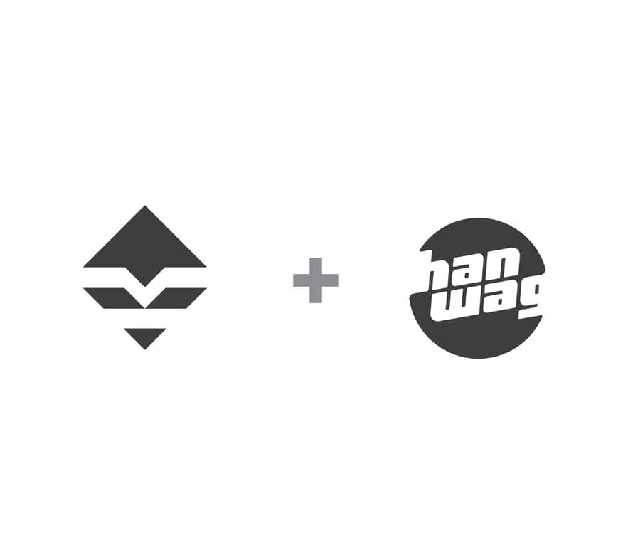
Do
A plus sign of any weight signals partnership.
For three or more partners, skip dividers and use monochrome versions of every mark. Optical balance beats alignment tools.